Table Of Contents
A bar chart is an excellent way to visualize data. In this article, we’ll show you SAS bar chart examples and how to create them in SAS using the SGPLOT procedure.
A bar chart is one of the most commonly used charts. It shows the distribution of a categorical variable or the comparison between two or more categories.

How to Create Bar Charts in SAS?
The SGPLOT procedure is the easiest way to create a bar chart in SAS. You need to set two parameters for a simple bar chart. First, you give the name of your dataset with the DATA= option. Then, tell the SAS what variable you want to plot with the VBAR statement.
In addition to simple graphs like scatter plots and line plots, the Statements and options in PROC SGPLOT let you change how your chart looks and add things like legends and reference lines.
The STAT= option can have values as FREQ, MEAN, MEDIAN, PERCENT and SUM(default)
For STAT=MEAN|MEDIAN|SUM, you must also specify the RESPONSE= option.
STAT= FREQ|PCT - When you specify the RESPONSE= option, FREQ calculates the frequency of the response variable; else, it calculates the frequency of the category variable.
How to create Vertical Bar Chart in SAS?
The simplest way to create a vertical bar chart is to specify the VBAR Statement followed by the variable you want to plot. Then, it creates a vertical bar chart with the unique categories on the horizontal axis and frequency counts on the vertical axis.
proc sgplot data=sashelp.cars;vbar type;TITLE 'Cars by Type';run;
This code uses a VBAR statement to create a vertical bar chart of the variable TYPE. The chart shows the frequency of car types in the SASHELP.CARS dataset.

How to create Horizontal Bar Chart in SAS?
Now, we will create a vertical bar chart. The only difference between the previous graph and this graph would be to change the option VBAR to HBAR.
proc sgplot data=sashelp.cars;hbar type;TITLE 'Cars by Type';run;
Bar Chart with Response Variable and Statistic
The default summary is the frequency count of the categorical variable in a bar chart. You can add a response variable to a bar chart in the RESPONSE= option.
First, in the RESPONSE=-option, define which variable you want to plot on the Y-axis.
Then, with the STAT=-option, you specify what statistic to show. For example, the sum or the mean.
The SAS code below creates a bar chart with the average of the mpg_City variable specified on the Y-axis.
title 'Mileage by Type';proc sgplot data=sashelp.cars;vbar type /response=mpg_citystat=mean;run;
Add Data Labels to your Bar Chart
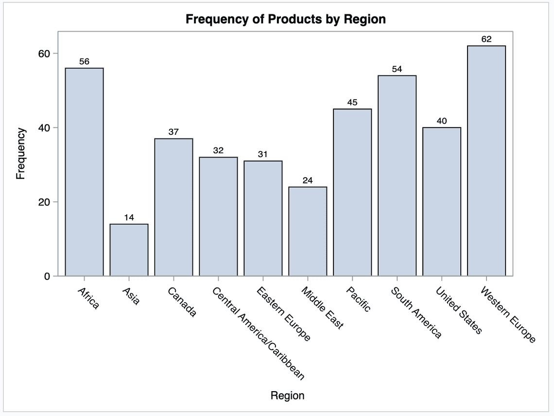
The datalabel option tells SAS to show specific statistics in the data label.
DATALABELPOS= specifies the location of the data label. you can specify any of the following
DATALABELPOS=DATA | BOTTOM | TOP
proc sgplot data=sashelp.shoes;vbar region / datalabel datalabelpos=data;title 'Frequency of Products by Region';run;
Add Axis Labels to your Bar Chart
The XAXIS and YAXIS statements are used to control the features and structure of the X and Y axes, respectively. It provides various options for customization. One of the customizations is that you can add labels to the axis.
proc sgplot data=sashelp.shoes;vbar region / datalabel datalabelpos=data;xaxis label="Region";yaxis label="Frequency of Shoe Product";title 'Frequency of Products by Region';run;
SAS Bar chart by Group
You can use the GROUP= option to create a hierarchical or grouped bar chart in SAS.
This bar chart is like the first one, except that the bars have been divided into groups using the GROUP= option.
proc sgplot data=sashelp.heart;vbar bp_status / group=sex datalabel seglabel;title 'Frequency of BP Status by Sex';run;
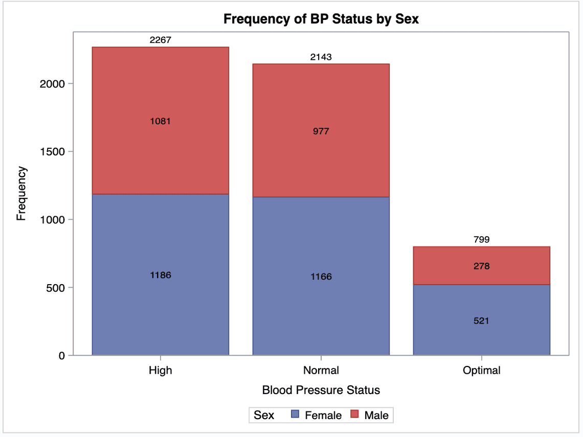
You need the SEGLABEL option to add data labels for each segment for a grouped bar chart or a stacked bar chart.
Cluster Grouped Bar Chart
The default value for the Groupdisplay option is STACK. A cluster grouped Bar Chart can be created using the SGPLOT procedure by specifying the option GROUPDISPLAY=CLUSTER. For example, using this option, you can create a cluster grouped Bar Chart as follows:
proc sgplot data=sashelp.heart;vbar bp_status / group=sex groupdisplay=cluster datalabel seglabel;run;
Bar Chart with Percentage of Frequency
A standard SAS bar chart shows the frequency of each category. However, You can use PROC SGPLOT to create a sas bar chart frequency.
You can use the STAT=option in all types of bar charts (i.e., vertical and horizontal, as well as grouped and stacked.
proc sgplot data=sashelp.heart;vbar bp_status / group=sex groupdisplay=cluster datalabel stat=pct seglabel;run;
Bar Chart with Response Variable Statistic
Horizontal and vertical bar charts are used to summarize the values of a category variable. A response variable is optional. By default, the summary shows the frequency count of the categorical variable.
In the RESPONSE= option, you can specify a numeric response variable for the plot. The summarized values of the response variable are displayed on the vertical axis.
With the STAT=-option, you can the statistic for the vertical axis.
STAT= option can have values as FREQ,MEAN,MEDIAN,PERCENT and SUM(default)
STAT= FREQ|PCT - When you specify the RESPONSE= option, FREQ calculates the frequency of the response variable; else, it calculates the frequency of the category variable.
The SAS code below creates a bar chart with the sum of the sales variable specified on the Y-axis.
proc sgplot data=sashelp.prdsale;vbar product / response=actual stat=sum datalabel datalabelattrs=(weight=bold);xaxis label="Product";yaxis label='Actual Sales by Product';title 'SASHELP.PRDSALE - Actual Sales by region';run;
Bar Chart with the response and group Variable
The below example shows a grouped bar chart with a response variable.
proc sgplot data=sashelp.prdsale;vbar product / response=actual stat=sum datalabel datalabelattrs=(weight=bold);xaxis label="Product";yaxis label='Actual Sales by Product';title 'SASHELP.PRDSALE - Actual Sales by region';run;
Segmented Bar Chart
Segmented Bar charts are one of the most popular charts used in Statistics. They are a type of stacked bar chart.
A segmented Bar chart is one kind of stacked bar chart, but each bar will show 100% of the discrete value.
For example, using the PROC FREQ procedure we can see that, there is a total of 5209 subjects. Out of them, 2267 have high blood pressure, 2143 are normal, and 729 are optimal. There are 2873 males and 2633 females in the sample dataset.
The data along the vertical side of the box represents bp_status. In contrast, the horizontal represents a certain percentage for bp_status.
Each bar will show the bp_status according to the number of males and females. The bars are separated by stacked order, representing one group for the male and the other for the female.
proc sgplot data=sashelp.heart pctlevel=group;hbar bp_status / group=sex groupdisplay=stack stat=pct datalabel;run;

Notice how the number of males and females separates the bars. They are also coloured distinctively to recognize each category of bp_status.
Vertical Segmented Bar Chart
The below code shows a Vertical Segmented Bar Chart
proc sgplot data=sashelp.cars pctlevel=group;vbar type / group=origin groupdisplay=stack stat=pct seglabel;xaxis discreteorder=data;yaxis grid values=(0.1 to 1 by 0.1) label="Percentage of Total with Group";title 'All groups in a category total 100%';run;
Creating a Bar-Line Chart
You can combine the VBAR and VLINE statements to create a vertical bar-line chart.
To create a horizontal Bar-lie chart, you can use HBAR and HLINE Statement.
The y2axis statement assigns the response variable to the secondary (right) vertical axis.
proc sgplot data=sashelp.prdsale;title "Predict vs. Actual Sales";vbar month / response=predict;vline month / response=actual y2axis markers;run;
The Y2AXIS option assigns the line plot to the Y2 axis.
Sorting bars in a bar chart
SAS orders the bars of a bar chart alphabetically based on the category names.
In SAS, you can change the order of the bars based on values instead of the categories with the CATEGORYORDER=-option.
It takes two options.
CATEGORYORDER= RespAsc | RespDesc.
RESPASC - sorts by the response values in ascending order.
RESPDESC - sorts by the response values in descending order.
Sorting the bars based on the frequency of each category
In the below example, we sort the bars based on the frequency of each category.
proc sgplot data=sashelp.heart;vbar deathcause / categoryorder=respdesc datalabel;run;
Sorting bard based on the response variable
In this example, we use the response variable to sort the bars.
proc sgplot data=sashelp.heart;vbar deathcause / response=ageatdeath stat=mean datalabel categoryorder=respdesc;run;

Sorting a grouped bar chart
You can also use the CATEGORYORDER=option or GROUPORDER= to order the bars of a grouped bar chart.
GROUPORDER= option specifies the ordering of the groups within a category.
GROUPORDER=DATA | REVERSEDATA | ASCENDING | DESCENDING
DATA : orders the groups within a category in the data order of the group variable.
REVERSEDATA : orders the groups within a category in the reverse data order of the group variable.
proc sgplot data=sashelp.heart;vbar deathcause / response=ageatdeath group=bp_status groupdisplay=clusterstat=pct seglabel grouporder=ascending;yaxis grid;run;
The category order is not affected by the value of the groups when a group variable is used with the CATEGORYORDER= option. The response statistic always sorts the categories at a category level.
The GROUPORDER= option is ignored when both the CATEGORY= option and the GROUPORDER= option are specified.
Customizing Legends in Proc SGPlot SAS
SAS adds a legend to the bottom of a grouped or stacked bar chart by default. However, you might want to change its location or appearance.
You change the appearance of the legend of a bar chart with the KEYLEGEND statement.
This statement starts with the KEYLEGEND keyword, followed by some options to modify its appearance and location.
You can suppress the legend by using the NOAUTOLEGEND option.
TITLE\= With TITLE=-option, you can specify the title of the legend. By default, the title of the legend is the name of the variable that defines the subcategories. You must place the new title between (double) quotes.
LOCATION\= option specifies whether the legend is placed outside or inside the axis area.
LOCATION=OUTSIDE | INSIDE
The OUTSIDE option places the legend outside of the axis area. The INSIDE option places the legend inside the axis area.
POSITION\= option specifies the position of the legend within the graph.
POSITION= BOTTOM |BOTTOMLEFT |BOTTOMRIGHT | LEFT |RIGHT |TOP| TOPLEFT|TOPRIGHT
ACROSS\= option specifies the number of columns in the legend. The number of columns is determined automatically by default.
SORTORDER\= option specifies the sort order to use for the legend entry labels.
SORTORDER=ASCENDING | DESCENDING | REVERSEAUTO
EXCLUDE\= With this option you can exclude certain items from the Legend
proc sgplot data=sashelp.cars;vbar origin / group=type groupdisplay=clusterstat=mean seglabel;yaxis grid;keylegend /title="Car Type"across=1location=insideposition=toprightsortorder=descendingexclude=("Truck");run;
SGplot Mouse-over
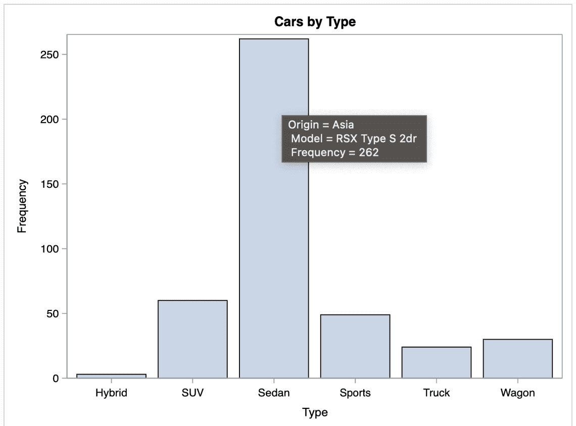
With the SGPlot procedure, you use the imagemap option in the ods graphics statement. Then mouse-over text will automatically be generated for each of the variables used in the plot.
For this simple example, the automatic mouse-over is adequate. Still, you might want to specify custom mouse-over text in a more complex example.
You can use the tip=() option to specify the variables you want to appear in the mouse-over text. Note that the text will always be preceded by the variable name (‘variable =’).
Also, if you have more than one line of mouse-over text, the 2nd line is always indented.
/*Tool tips*/ods html;/* use HTML destination */ods graphics on / imagemap;proc sgplot data=sashelp.cars;vbar type /tip=(origin model);TITLE 'Cars by Type';run;
How to create an error Bar chart in SAS?
An error bar is a (usually T-shaped) bar on a graph that shows how much error is in the chart. The errors represent a range or spread of data that shows uncertainty. For example, the bar could show a confidence interval or the standard error.
You can add error bars to a bar chart in SAS with the LIMITS=option.
LIMITS=BOTH | LOWER | UPPER
LIMIT = option Specifies which limit lines to display. Limits are displayed as heavier line segments with a serif extending from each bar at the end.
Upper limits extend to the bar’s right, and lower limits extend to the bar’s left.
By default, no limits are displayed unless you specify either the LIMITS= or LIMITSTAT= option.
If you use LIMITS = BOTH, SAS adds each bar’s upper and lower limit to the plot.
If you specify the LIMITSTAT= option only, then LIMITS=BOTH is the default.
Limit lines are displayed only when you specify STAT= MEAN.
You can also use the LIMITSTAT = STDDEV to show the standard deviation or LIMITSTAT = STDERR for the standard error.
LIMITSTAT=CLM | STDDEV | STDERR
With the LIMITSTAT=-option, you can specify the statistic of the limit. For example, if you specify the LIMITS= option, the default for LIMITSTAT= is 95% confidence limits. Otherwise, there is no default.
If you specify the LIMITSTAT= option only, then the default value for the LIMITS= option is BOTH.
If you use the GROUP= option in the plot statement, the LIMITSTAT= option has no effect unless you specify GROUPDISPLAY=CLUSTER.
This example uses the SASHELP.HEART data set to chart the mean Diastolic heart rate for the category of death and error bars showing the Standard deviation of the heart rate. The response axis label describes the confidence limit for the error bars.
proc sgplot data=sashelp.heart;vbar deathcause / response=diastolic stat=mean datalabel limitstat=stddev missing;run;
The “Takeaway”:
So, this was our side of creating BAR charts in SAS using the PROC SGPLOT procedure. We hope that you must have found it helpful.
For more examples, you can refer to Graphics Samples Output Gallery.
Moreover, if you have any other suggestions, suggest them below the comment section. We would take those lists in our further blog post.
Thanks for reading!
If you liked this article, you might also want to read How to delete SAS datasets and use Proc Contents to describe SAS datasets.
Do you have any tips to add? Let us know in the comments?
Please subscribe to our mailing list for weekly updates. You can also find us on Instagram and Facebook.

