Proc Univariate and Proc Means are SAS procedures that calculate statistics for quantitative variables.
Proc Univariate provides a wider variety of statistics and graphs than the proc means. It helps you to discover key information about the distribution of each variable, such as
If the data is approximately normally distributed
Identifying outliers in the data
The distribution of data for variables differs by a group.
“Syntax”:
PROC UNIVARIATE <options>; <statements>
The commonly used options for PROC UNIVARIATE “include”:
DATA= - Specifies data set to use
NORMAL - Produces a test of normality
FREQ Produces a frequency table
PLOT Produces stem-and-leaf plot
The Commonly used statements used with PROC UNIVARIATE “include”:
BY variable list;
VAR variable list;
OUTPUT OUT = dataset name;
The BY group specification causes UNIVARIATE to calculate statistics separately for group observations (i.e., treatment means).
The OUTPUT OUT= statement allows you to output the means to a new data set.
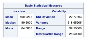
The first table generated is the Moments table. it provides a list ofdescriptive statistics for the variable weight.
N is the sample size.
Sum weights are the same as the sample size. However, the weight statements are used to identify a separate variable that contains counts for each observation. The default weight variable is defined to be 1 for each observation. This field is the sum of observation values for the weight variable. Since we didn’t specify a weight variable, SAS uses the default weight variable. Therefore, the sum of weight is the same as the number of observations.
Mean is the arithmetic mean or the average.
Sum of Observations is the total sum of all the data values.
Std Deviation is the standard deviation.
Variance is the measure of the distribution spread and the square of standard deviation.
Skewness is the measure of the symmetry of the data.
Kurtosis is the shape of the distribution.
Uncorrelated SS is the sum of the squared values.
Corrected SS is the sum. of the squared deviations from the mean and is the quantity used in the calculation of standard deviation and other statistics.
Coef Variation is the coefficient of variation and is a unitless measure of variability.
Std Err Mean is the standard error of the mean.It is calculated by dividing Standard deviation with $$ \sqrt{N} $$.
Signed Rank Test is a non-parametric test often used instead of the Student’s t-test when the data is not normally distributed, and the sample sizes are small.
In this table, the commonly used quantiles of the data are listed.
The quantiles provide information about the distribution’s tails and include the five number summaries for each variable. These consist of the variables’ minimum, lower quartile, median, upper quartile, and maximum values.
You can also calculate custom percentiles with the PCTLPTS\= option, like 10, 20, 30, 40, 50 and Q3(75th) percentiles.
proc univariate data = sashelp.iris ;
var sepallength;
output out = pctds
pctlpts = 10 to 50 by 10,q3=quartile3 pctlpre = pct_ pctlname=P10 P20;
The pctlpre is the prefix to add for the variables. The pctlname is to create suffixes to create the names for the variables that contain the PCTLPTS= percentiles, and the Output statement is to save the values in a SAS dataset.
A histogram is a commonly used plot for visually examining the distribution of a set of data. You can create a histogram in PROC UNIVARIATE with the following statement.
HISTOGRAM SEPALLENGTH/NORMAL
The normal option creates a superimposed normal curve.
proc univariate data=sashelp.shoes NOPRINT;
var sales;
HISTOGRAM / NORMAL (COLOR=RED);
run;

Skewness is a measure of the degree of asymmetry of a distribution. If skewness is close to 0, it indicates data is normally distributed.
If Skewness > 0, data is Positively skewed, meaning that there are a few extreme values or outliers with large values. In positively skewed data, the mean is greater than the median, and the median is greater than the mode.
If skewness < 0, it indicates data is negatively skewed, meaning there are a few outliers with small values.
Rules for Skewness :
If skewness < −1 or > +1, the distribution is positively or negatively skewed.
The distribution is moderately skewed if skewness is between −1 and −0.5 or between 0.5 and +1.
If skewness > −0.5 and < 0.5, the data is normally distributed.
Test for normality is another way to assess whether the data is normally distributed. Four test statistics are displayed in the table.
Shapiro Wilk
Kolmogorov test
Cramer-Von Mises
Anderson darling
The NORMAL option is included in the PROC UNIVARIATE to test for the normality of data.
Shapiro Wilk and Kolmogorov tests are the two mainly used methods. The p-values below are for testing the null hypothesis that the variable is normally distributed. If the p-value is greater than 0.05, you may assume that the data is normally distributed.
The Shapiro-Wilk test gives you a W value. Smaller values indicate data is not normally distributed, and you can reject the null hypothesis. This test works well for a sample size of less than 2000.
Kolmogorov test
The Kolmogorov test is also known as KS Test, and this test can handle a large sample size.
From Wikipedia,
The Kolmogorov–Smirnov statistic quantifies a distance between the empirical distribution function of the sample and the cumulative distribution function of the reference distribution, or between the empirical distribution functions of two samples.
The Winsorized and Trimmed Means are extremely sensitive to a single outlier. When the data has highly skewed, a percentage of data is removed, and then the mean is calculated when the data is highly skewed.
The percentage tells you what percentage of data to remove. For example, with a 5% trimmed mean, the data’s lowest 5% and highest 5% are excluded. The mean is calculated from the remaining 90% of data points.
Winsorized means is a method that replaces extreme values (smallest or largest) with the closest observations, and then means are calculated. It is the same as the trimmed mean except for removing the extreme values. We are capping a percentage of values from both ends of the data.
The horizontal histogram (top-left) is a visual representation of the distribution of the sales value. In normally distributed data, the peak will be in the middle with equal trails trailing on either side.
The box-and-whiskers plot (top-right) is a graphical representation of the quartiles of the data. The box represents 50 % of the data(the middle), and the whiskers represent 25% of the data on each side.
The centre line represents the median which is the 50th percentile.
The diamond symbol ◇ indicates the mean.
The circles ◦ that stand at the top of the box plot indicate extreme values.
The normal probability plot (bottom) provides a graphical representation of the plot of points shown as dots that lie in a tight scatter around the reference (diagonal) line.