


Table Of Contents


What are Categorical Data?
Categorical data are the type of data collected to record qualities or characteristics of the individual, such as eye colour (Black or Blue), gender(Male or Female), or opinion on some issue (using categories such as agree, disagree, or no opinion).
In categorical, where individuals are placed into groups, such as gender or political affiliation, they are summarised using the number of individuals in each group, called the frequency or the percentage of individuals in each group (the relative frequency).
How to Summarise Categorical Data?
You can summarise categorical data by first sorting the values according to the categories of the variable. Then, place the count, amount, or percentage of each category into a summary table or one of several types of charts.
What is a Summary Table?
A summary table is a two-column table in which the category names are listed in the first column, and the count, amount, or percentage of values are listed in the second column. Sometimes, additional columns represent the same data in more than one way (for example, counts and percentages).
If your data contains more than one category, use a Contingency table. See section 5 for more on contingency tables.
Example
When asked about specific issues they were worried about when shopping online can be presented using a summary “table”:
| Online MarketPlaces
|
Percentage
| | | |
|
Hackers stealing details
| 65% | |
Identity theft
| 59% | |
Scammers stealing money
| 56% | |
Buying something by mistake
| 33% |
”Source”: Data extracted and adapted from “The good, bad and ugly of online shopping” MarkMonitor Online Barometer, Global Online Shopping Survey 2018, p. 6.
Interpretation
Summary tables enable you to see the big picture of a data set. In this example, you can conclude that more than half the people are worried about shopping online because of Hackers Stealing details, and almost 70% of people are worried due to online scams and hackers.
Which graphs are used for Categorical data?
The main purpose of any data is to organize and display them correctly. In this article, I have described the most common data displays used to summarize categorical data and helpful tips for evaluating them.
Bar Chart
A bar chart contains rectangles known as bars. The length of each bar represents the count, amount, or percentage of responses in one category.
Example
This percentage bar chart presents the data of the summary table discussed in the previous “example”:
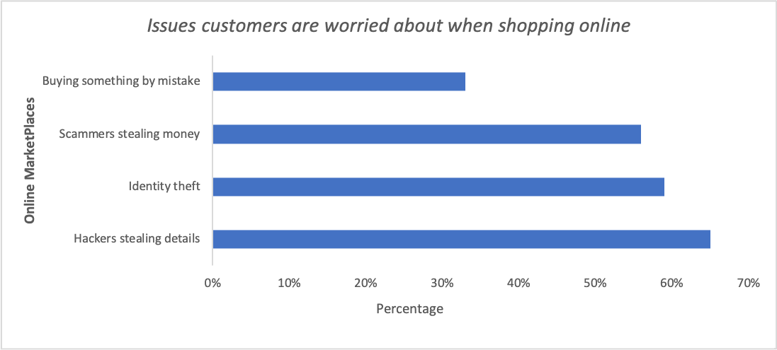
Interpretation
A bar chart is better than a summary table at making the point that the category’s better prices are the single largest category for this example.
For most people, scanning a bar chart is easier than scanning a column of numbers in which the numbers are unordered, as they are in the bill payment summary table.
Guidelines for evaluating bar graphs
- Check the units on the y-axis. Make sure they are evenly spaced.
- Be aware of the scale of the bar graph (the units in which bar heights are represented). You can make differences look more dramatic by using a smaller scale (for example, each half-inch of height represents ten units versus 50).
- If the bars represent percentages and not counts, make sure to ask for the total number of individuals summarised by the bar graph if it is not listed.
Pie Chart
A pie chart is in a form of a circle that contains wedge-shaped areas known as pie slices. Each pie slices represent the count, amount, or percentage of each category and the entire circle of the pie represents the total.
Example
This pie chart presents the data from the summary table discussed in the preceding two “examples”:
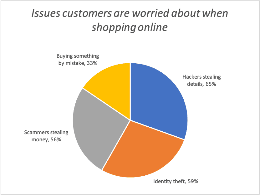
Interpretation
The pie chart enables you to see each category portion of the whole. You can see that more young adults shopped online for better prices or to avoid holiday shopping, a small number shopped online for better selection, and hardly anyone shopped online because of direct shipment.
Guidelines to evaluate a pie chart for statistical “correctness”:
- Check to be sure the percentages add up to 100% or close to it (any round-off error should be very small)
- Beware of slices of the pie called “other” that are larger than many other slices. This shows a lack of detail in the information gathered.
- A pie chart only shows the percentage in each group, not the number in each group. Always ask for or look for a report of the total size of the data set.
Pareto Chart
A Pareto Chart is a special type of bar chart that presents the counts, amounts, or percentages of each category in descending order left to right and also contains a superimposed plotted line that represents a running cumulative percentage.
Example
| Cause | Frequency | Cumulative Frequency | Percent | Cumulative Percent |
|---|---|---|---|---|
| Warped card jammed | 365 | 365 | 0.5 | 0.5 |
| Card unreadable | 234 | 599 | 0.32 | 0.83 |
| ATM malfunctions | 32 | 631 | 0.04 | 0.87 |
| ATM out of cash | 28 | 659 | 0.04 | 0.91 |
| Invalid amount requested | 23 | 682 | 0.03 | 0.94 |
| wrong keystroke | 23 | 705 | 0.03 | 0.97 |
| Lack of funds in an account | 19 | 724 | 0.03 | 1 |
| Total | 724 | 1 |
”Source”: Data extracted from A. Bhalla, “Don’t Misuse the Pareto Principle,” Six Sigma Forum Magazine, May 2009, pp. 15–18.

This Pareto chart uses the table data immediately preceding it to highlight the causes of incomplete ATM transactions.
Interpretation
When you have many categories, a Pareto chart enables you to focus on the most important categories by visually separating the vital few from the trivial many categories.
For the incomplete ATM transactions data, the Pareto chart shows that two categories, warped card jammed and card unreadable, account for more than 80% of all defects and that those two categories, combined with the ATM malfunctions and ATM out of cash categories account for more than 90% of all defects.
To create a Pareto chart in excel, refer to Excel Easy.
Contingency Table - A Two-Way Cross-Classification Table
Contingency tables (cross tabs or two-way tables) are multicolumn tables that present the count or percentage of responses for two categorical variables. In a two-way table, the categories of one of the variables form the rows of the table, while the categories of the second variable form the columns.
The “outside” of the table contains a special row and a special column that contain the totals. Cross-classification tables are also known as cross-tabulation tables.
Example
Downloads Cross-Classified by Type of Call-to-Action Button
This two-way cross-classification table summarizes the results of a webpage design study that investigated whether a new call to action button would increase the number of downloads. Tables showing row percentages, column percentages, and overall total percentages follow.
| Downloads | Original | New | Total |
|---|---|---|---|
| Yes | 351 | 451 | 802 |
| No | 3291 | 3105 | 6396 |
| Total | 3642 | 3556 | 7198 |
Row percentage table
| Downloads | Original | New | Total |
|---|---|---|---|
| Yes | $$ \frac{351}{802}\approx 44 $$% | $$ \frac{451}{802}\approx 56% $$% | $$ \frac{802}{802}\approx 100 $$% |
| No | $$ \frac{3291}{6396}\approx 51 $$% | $$ \frac{3105}{6396}\approx 49 $$% | $$ \frac{6396}{6396}\approx 100 $$% |
| Total | $$ \frac{3642}{7198}\approx 50 $$% | $$ \frac{6}{8}\approx 75 $$% | $$ \frac{7198}{7198}\approx 100 $$% |
Column Percentage Table
| Downloads | Original | New | Total |
|---|---|---|---|
| Yes | $$ \frac{351}{3642}\approx 9 $$% | $$ \frac{451}{3556}\approx 13% $$% | $$ \frac{802}{7198}\approx 11 $$% |
| No | $$ \frac{3291}{3642}\approx 90 $$% | $$ \frac{3105}{3556}\approx 49 $$% | $$ \frac{6396}{7198}\approx 100 $$% |
| Total | $$ \frac{3642}{3642}\approx 100 $$% | $$ \frac{3556}{3556}\approx 100 $$% | $$ \frac{7198}{7198}\approx 100 $$% |
Overall Percentage Table
| Downloads | Original | New | Total |
|---|---|---|---|
| Yes | $$ \frac{351}{7198}\approx 5 $$% | $$ \frac{451}{7198}\approx 6% $$% | $$ \frac{802}{7198}\approx 11 $$% |
| No | $$ \frac{3291}{7198}\approx 46 $$% | $$ \frac{3105}{7198}\approx 43 $$% | $$ \frac{6396}{7198}\approx 89 $$% |
| Total | $$ \frac{3642}{7198}\approx 51 $$% | $$ \frac{3556}{7198}\approx 49 $$% | $$ \frac{6396}{7198}\approx 100 $$% |
Interpretation
The simplest two-way table contains a row variable with two categories and a column variable with two categories. This creates a table that has two rows and two columns in its inner part. Each inner cell represents the count or percentage of a pairing, or cross-classifying, of categories from each variable.
| First Column category | Second Column Category | Total | |
|---|---|---|---|
| First Row category | Count of percentage for first row and first column | Count of percentage for the first row and the second column | Total for the first-row category |
| Second-row category | Count of percentage for the second row and first column | Count of percentage for the second row and second column | Total for second-row category |
| Total | Total for first column category | Total for second column category | Overall Total |
Two-way tables can reveal the combination of values most often in data. In this example, the tables reveal that the new call to action button is more likely to have downloads than the original call to action button.
Because the number of visitors to each webpage was unequal in this example, you can see this pattern best in the Column Percentages table.
That table shows that the new button is more likely to increase downloads than the original one. Pivot Tables create worksheet summary tables from sample data and are a good way of creating a two-way table from sample data.
General Guidelines to follow when creating your charts
- Always choose the simplest chart that can present your data.
- Always supply a title.
- Always label every axis.
- Avoid unnecessary decorations or illustrations around the borders or in the background.
- Avoid the use of fancy pictorial symbols to represent data values.
- Avoid 3D versions of bar and pie charts.
- If the chart contains multiple axes, always include a scale for each axis.
- When charting non-negative values, the scale on the vertical axis should begin at zero.
Key Takeaway
To choose an appropriate table or chart type, begin by determining whether your data are categorical or numerical. If your data are “categorical”:
Determine whether you are presenting one or two variables.
- If one variable, use a summary table and/or bar chart, pie chart, or Pareto chart.
- If there are two variables, use a two-way cross-classification table.
If your data are “numerical”:
- If charting one variable, use a frequency and percentage distribution and/or histogram.
- If charting two variables, if the time order of the data is important, use a time-series plot; otherwise, use a scatter plot.
If you liked this article, you might also want to read Descriptive Statistics in SAS with Examples.
Do you have any tips to add? Let us know in the comments.
Please subscribe to our mailing list for weekly updates. You can also find us on Instagram and Facebook.