


Table Of Contents


A box plot (also known as a box and whisker plot) is a chart often used in descriptive data analysis to visually show the distribution of numerical data and skewness by displaying the data quartiles (or percentiles) averages.
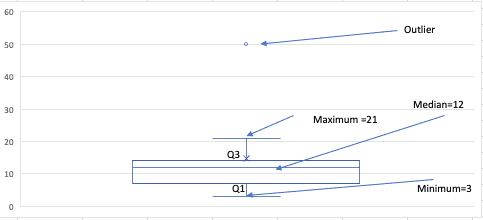
Box plots show the five-number summary of a set of “data”: the minimum score, first (lower) quartile, median, third (upper) quartile, and maximum score.
First Quartile (Q1/25th Percentile): It is the middle number between the smallest and median of the dataset.
Median (Q2/50th Percentile): Median is the middle value of the dataset.
Third quartile (Q3/75th Percentile): The middle value between the median and the dataset’s highest value.
Interquartile range (IQR): 25th to the 75th Percentile.
Whiskers: The whiskers go from each quartile to the minimum or maximum. The upper and lower whiskers represent values outside the middle 50% (i.e. the lower 25% of values and the upper 25% of values).
“Outliers”: Outlier is an observation numerically separated from the rest of the data.
“Minimum”: The lowest value, excluding outliers. “minimum”: Q1 -1.5*IQR
“Maximum”: The highest value, excluding outliers. “maximum”: Q3 + 1.5*IQR
An Example of Box and Whisker Plot
Draw a box and whisker plot for the data set {3, 7, 8, 5, 12, 14, 21, 13, 18,50}.
Step “1”: Order the data in ascending order.
3,7,8,5,12,14,21,13,18,50
Step “2”: Find the median.
The median is the mean of the middle two “numbers”:
3,7,8,5,12,14,21,13,18,22
$$ \frac{12+14}{2}= 13 $$
The median is 13
Step “3”: Find the quartiles.
The first quartile is the median of the data points to the left of the median.
3,7,8,5,12
Q1=8
The third quartile is the median of the data points to the right of the median.
14,21,13,18,22
Q3=13
Step “4”: Complete the five-number summary by finding the min and the max.
The min is the smallest data point, which is 3. The max is the largest data point, which is 50.
Step “6”: Scale and label an axis that fits the datasets.
 Box and Whisker Plot
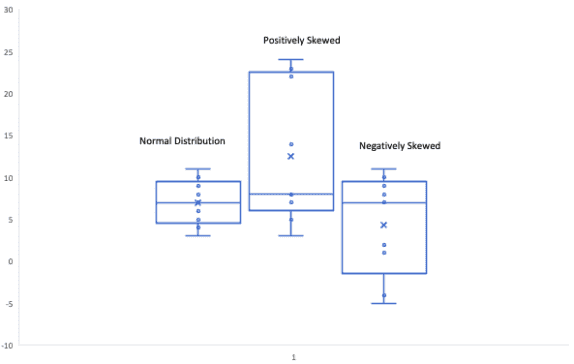
Interpretation of Box and Whisker Plot
Normal Distribution or Symmetric “Distribution”: If a box plot has equal proportions around the median and the whiskers are the same on both sides of the box then the distribution is normal.
Positively Skewed: A distribution is positively skewed when the median is closer to the bottom quartile (Q1).
Negatively “Skewed”: When the median is closer to the upper quartile (Q3) and the whisker is shorter on the upper end of the box, then the distribution is negatively skewed.
 Interpretation of Box and Whisker Plot
Interquartile range (IQR): The box plot depicting the median 50 per cent of scores is computed by subtracting the lower quartile from the upper quartile (e.g., Q3-Q1).
“Outlier”: If a data point is more than 1.5 times the interquartile range (IQR) above the top quartile (Q3), it will be declared an outlier.
Q3 + 1.5 * IQR
Similarly, if a value is lower than the 1.5*IQR below the lower quartile (Q1), the value will be considered an outlier.
Q1 - 1.5 * IQR
How to create a Box and Whisker plot in SAS?
You can create a BOX Plot in SAS using the SG PLOT procedure. First, let us look at a very simple example. I have used the same data set as above in this article.
We use the VBOX or HBOX Statement in PROC SGPLOT and specify the analysis variable.
data inp;input var @@;datalines;3 7 8 5 12 14 21 13 18 50;run;
To create a vertical BOX Plot use the VBOX statement as below.
proc sgplot data=inp;vbox var;run;
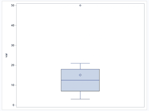 Box and Whisker plot in SAS
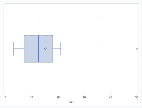
To create a horizontal BOX Plot use the HBOX statement as below.
proc sgplot data=inp;hbox var;run;
Using Category = option
In PROC SGPLOT, you can specify a categorical variable in the category= option.
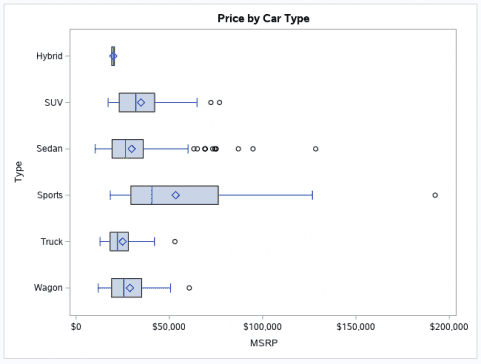
proc sgplot data=sashelp.cars;title "Price by Car Type";hbox msrp / category=type;run;
You can see the result from PROC SGPLOT below. This is a horizontal box plot. The square in the box indicates the group mean. The vertical line inside the box is the median (50’th percentile).
The two vertical lines that constitute the top and bottom of the box also know as the whiskers are the 25’th (Q1) and 75’th (Q3) percentiles respectively.
Summary
In this SAS tutorial, we learned what a boxplot is and how to create and interpret a boxplot in SAS. Stay tuned for more intriguing topics, and post any questions in the comments below.